Azure Integration Services Explained: Logic Apps, Service Bus, API Management, and Event Grid
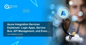
Azure Integration Services is Microsoft's suite of cloud-native tools for connecting applications, data, and processes across your enterprise. When your

Patient data systems, compliance reporting, and workflow automation for regulated environments.
Real-time tracking, route optimization, and inventory visibility across your distribution network.
Scale your product infrastructure, integrate third-party tools, and ship features faster with reliable ops.
Secure transaction processing, regulatory reporting, and customer-facing portals for financial services.
Most SMBs assume business intelligence tools require a dedicated data team. That's not accurate anymore.
Power BI Pro costs $10 per user per month and unlocks sharing and collaboration. Power BI Premium Per User (PPU) is $20 per month and adds AI features and paginated reports. For a 10-person SMB sharing Power BI dashboards across three departments, you're looking at $100-$200 per month total. That's comparable to what many teams spend on a single SaaS analytics add-on with far less flexibility.
The other practical advantage: if you're already on Microsoft 365, Power BI connects to your existing data in a few clicks. Excel workbooks, SharePoint lists, Dataverse tables, and Azure SQL databases all connect natively. There's no ETL middleware to configure or maintain.
See Power Platform licensing for SMBs in 2026: what you actually pay for a full breakdown of what each tier actually costs once you factor in Microsoft 365 bundle pricing.


Written by Rohit Dabra
Co-Founder and CTO, QServices IT Solutions Pvt Ltd
Rohit Dabra is the Co-Founder and Chief Technology Officer at QServices, a software development company focused on building practical digital solutions for businesses. At QServices, Rohit works closely with startups and growing businesses to design and develop web platforms, mobile applications, and scalable cloud systems. He is particularly interested in automation and artificial intelligence, building systems that automate routine tasks for teams and organizations.
Talk to Our ExpertsAzure Integration Services is Microsoft's suite of cloud-native tools for connecting applications, data, and processes across your enterprise. When your

Power BI Embedded is Microsoft's developer-focused API for embedding interactive analytics directly inside third-party apps, customer portals, and SaaS products.
Power apps portals sit at an interesting crossroads for IT leaders: they're fast, deeply integrated with the Microsoft stack, and
Azure AI Foundry is reshaping how enterprise teams build, deploy, and govern AI at scale, and the comparison with AWS Bedrock has become one of the defining platform decisions of 2025. If your organization runs on Microsoft 365, Teams, or Dynamics 365, or if you’re planning azure cloud migration services in the near term, the platform you choose here will affect every AI workload you build for the next five years.
This post cuts through the marketing to compare both platforms on model selection, developer tooling, enterprise security, cost, and real-world fit for Microsoft-ecosystem businesses. We’ll also answer the PAA questions that IT leaders keep searching for, including whether Azure is cheaper than AWS for enterprise and what an Azure managed services provider actually does.
React Native is a cross-platform framework built by Meta that allows development teams to write a shared JavaScript codebase and deploy to both iOS and Android. For enterprise architects evaluating mobile strategy in 2025, the choice between react native development, Flutter, and Xamarin goes well beyond which syntax your team prefers. It touches deployment timelines, maintenance costs, existing skill sets, and how tightly the front end needs to connect to your backend infrastructure.
This post breaks down all three frameworks across performance, developer experience, enterprise support, and Azure cloud integration. By the end, you’ll have a clear picture of which framework fits your organization, and when alternatives like Power Apps make more sense than a custom mobile build.

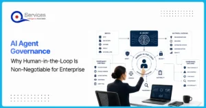
AI agent governance is the practice of establishing policies, controls, and human oversight mechanisms that determine how AI agents operate, make decisions, and interact with business systems. For enterprises deploying AI today, this isn’t optional paperwork. It’s the difference between AI that delivers measurable value and AI that creates liability.
The pressure to ship AI quickly is real. Microsoft Copilot, Azure OpenAI, and Power Platform’s AI Builder have made it easier than ever to wire autonomous agents into workflows. But “easy to deploy” doesn’t mean “safe to leave unsupervised.” Every enterprise that skipped governance in the rush to launch has eventually paid for it, whether through data leaks, compliance failures, or decisions no one can explain to an auditor.
This post covers why human-in-the-loop (HITL) oversight is non-negotiable for enterprise AI, what a real governance framework looks like, and how QServices approaches this with clients across healthcare, banking, and logistics.


Azure AI Foundry is reshaping how enterprise teams build, deploy, and govern AI at scale, and the comparison with AWS Bedrock has become one of the defining platform decisions of 2025. If your organization runs on Microsoft 365, Teams, or Dynamics 365, or if you’re planning azure cloud migration services in the near term, the platform you choose here will affect every AI workload you build for the next five years.
This post cuts through the marketing to compare both platforms on model selection, developer tooling, enterprise security, cost, and real-world fit for Microsoft-ecosystem businesses. We’ll also answer the PAA questions that IT leaders keep searching for, including whether Azure is cheaper than AWS for enterprise and what an Azure managed services provider actually does.

React Native is a cross-platform framework built by Meta that allows development teams to write a shared JavaScript codebase and deploy to both iOS and Android. For enterprise architects evaluating mobile strategy in 2025, the choice between react native development, Flutter, and Xamarin goes well beyond which syntax your team prefers. It touches deployment timelines, maintenance costs, existing skill sets, and how tightly the front end needs to connect to your backend infrastructure.
This post breaks down all three frameworks across performance, developer experience, enterprise support, and Azure cloud integration. By the end, you’ll have a clear picture of which framework fits your organization, and when alternatives like Power Apps make more sense than a custom mobile build.
AI agent governance is the practice of establishing policies, controls, and human oversight mechanisms that determine how AI agents operate, make decisions, and interact with business systems. For enterprises deploying AI today, this isn’t optional paperwork. It’s the difference between AI that delivers measurable value and AI that creates liability.
The pressure to ship AI quickly is real. Microsoft Copilot, Azure OpenAI, and Power Platform’s AI Builder have made it easier than ever to wire autonomous agents into workflows. But “easy to deploy” doesn’t mean “safe to leave unsupervised.” Every enterprise that skipped governance in the rush to launch has eventually paid for it, whether through data leaks, compliance failures, or decisions no one can explain to an auditor.
This post covers why human-in-the-loop (HITL) oversight is non-negotiable for enterprise AI, what a real governance framework looks like, and how QServices approaches this with clients across healthcare, banking, and logistics.